How the right information collapses uncertainty in a highly variable world
One of the questions I constantly receive during sales calls, after explaining our ability to provide ECM forecasts with sparse information, is “how is this possible”? Typically I’ll (somewhat unconvincingly) go into deep technical detail on the mechanism of the machine-learning models — how inputs can be correlated and inferred, the very good results of our pinball loss during model evaluation, and so on. After enough empty stares, we realized we were missing the mark.
We were fighting with a truth known to every building and energy engineer: that energy conservation measure (ECM) savings are inherently variable from building to building, far more than size or total energy use alone would suggest. Two outwardly similar buildings can realize very different savings from the same retrofit, because the outcome depends on how the building is actually operated: its climate, its existing systems, and its real energy intensity. Often the cause of a large inefficiency is some small, fine detail — a misconfigured control, a malfunctioning damper. Every engagement is a snowflake.
The short answer, which the rest of this post unpacks: yes, every building is a snowflake — but as we gather simple, easily accessible data, patterns emerge that dramatically reduce the uncertainty of a prediction. To illustrate this, we’ve used NREL’s ComStock dataset to compile a robust simulated building stock with ECM savings measurements.
The same measure, very different outcomes
Consider one well-defined ECM — replacing rooftop units with variable-speed heat pumps (electric backup) — applied across every applicable commercial building in the stock. Even after normalizing for floor area (i.e., looking at savings per square foot, which removes the trivial size effect), the realized savings span an enormous range:
| Metric (site-energy savings intensity, kWh/ft²·yr) | Value |
|---|---|
| Median | 9.4 |
| 10th percentile (p10) | 3.2 |
| 90th percentile (p90) | 24.9 |
| p90 / p10 ratio | ~7.8× |
| Coefficient of variation | ~0.80 |
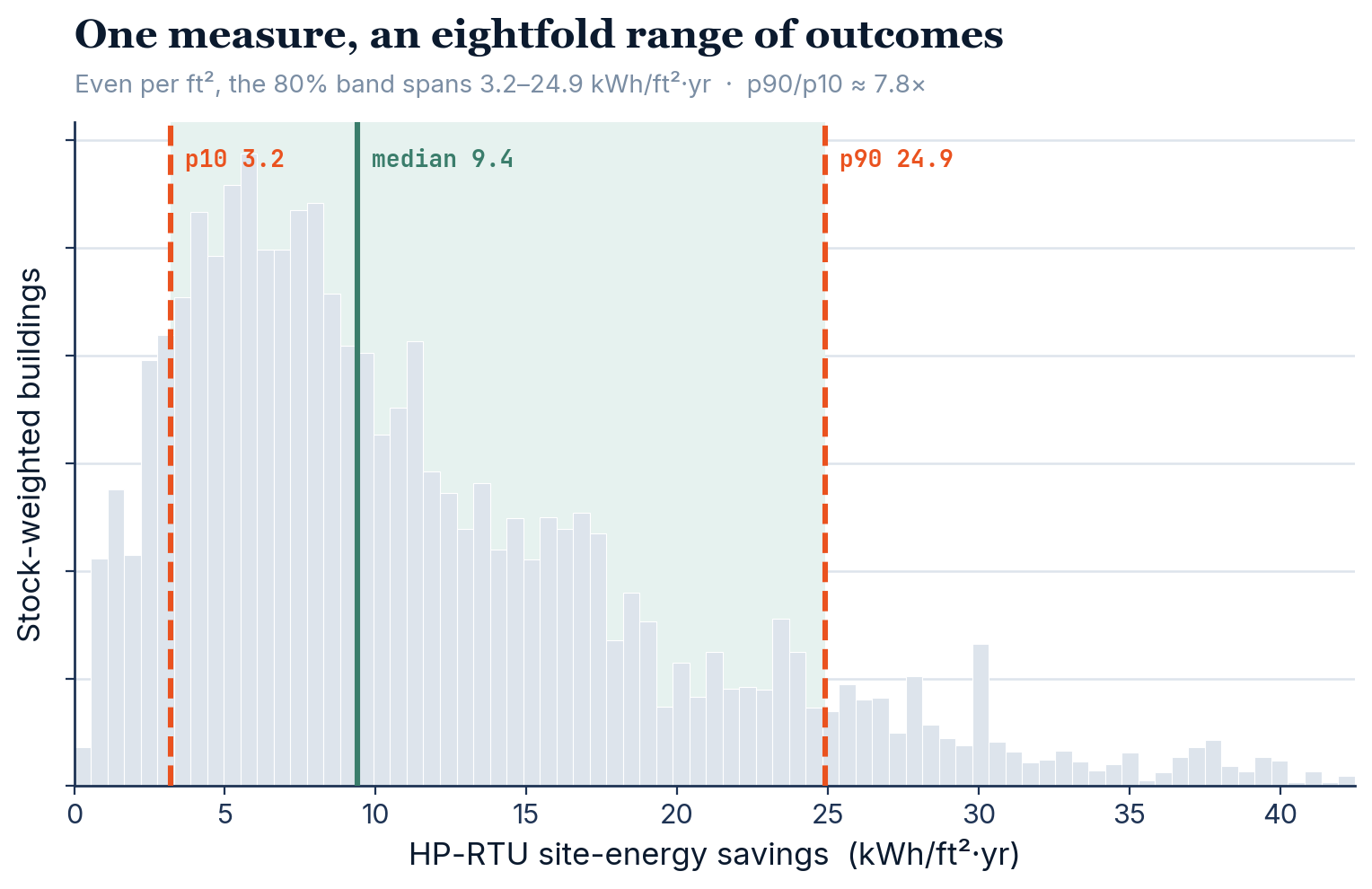
Knowing only “this is an RTU-served commercial building” and its floor area, an 80% forecast interval spans 3.2–24.9 kWh/ft²·yr — nearly an eightfold range. This spread is not measurement noise; it is genuine building-to-building heterogeneity in the physics of how much energy the measure saves.
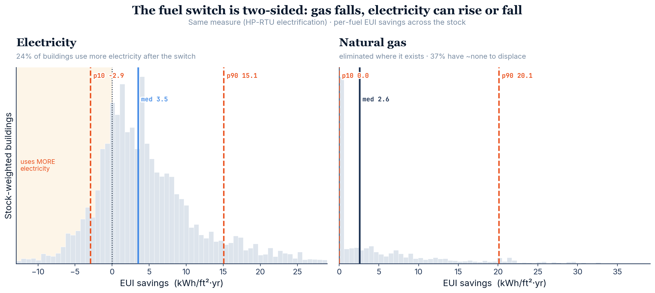
A further subtlety for fuel-switching measures: the effect is two-sided. The gas eliminated is highly skewed (many buildings have little or no gas heating to displace), and the change in electricity goes both ways — for some buildings electricity use rises (added heat-pump load), for others it falls (cooling-efficiency gains dominate). A single net number conceals this; a distribution does not.
Why the variability exists – and what drives it
Given the high variability in measure savings building to building, the next question is whether that variability is clustered, or if specific pieces of information can be strong predictors of performance, thereby reducing that variability. This is the crux of the problem we’re trying to solve.
To further explore this variability, we take a series of available building properties, and calculate how effective each is at reducing uncertainty and variability in savings. To calculate this, we group buildings by the input — into roughly equal-size bins for numeric inputs (for example, energy-intensity deciles) or by category for things like building type — and compare the spread of savings between groups to the total spread across all buildings. This is the proportion of variance explained (PVE), also known as the correlation ratio (η²) from a one-way analysis of variance. It follows directly from the law of total variance:
total variance in savings = variance explained by the input + variance left within the groups
PVE is the first term as a fraction of the total. It runs from 0 (the input tells you nothing — every group saves about the same) to 1 (the input fully determines savings). Everything is weighted so the result reflects the real building stock, not the raw simulation sample.
Note, this looks at each input in isolation, so closely related inputs (several energy-intensity measures, for instance) each score highly while largely explaining the same thing. The values are not additive — a later section chains inputs together and measures how much each additional one reduces uncertainty.
The figure below shows this independent PVE for 14 common attributes; a higher PVE indicates a greater reduction in variance (higher predictability) across our savings dataset. When we split buildings into ten bins by their baseline energy intensity, the differences in average savings across those bins account for roughly 52% of all the variation in savings. Building type explains about 25%; heating fuel on its own, only about 4%.
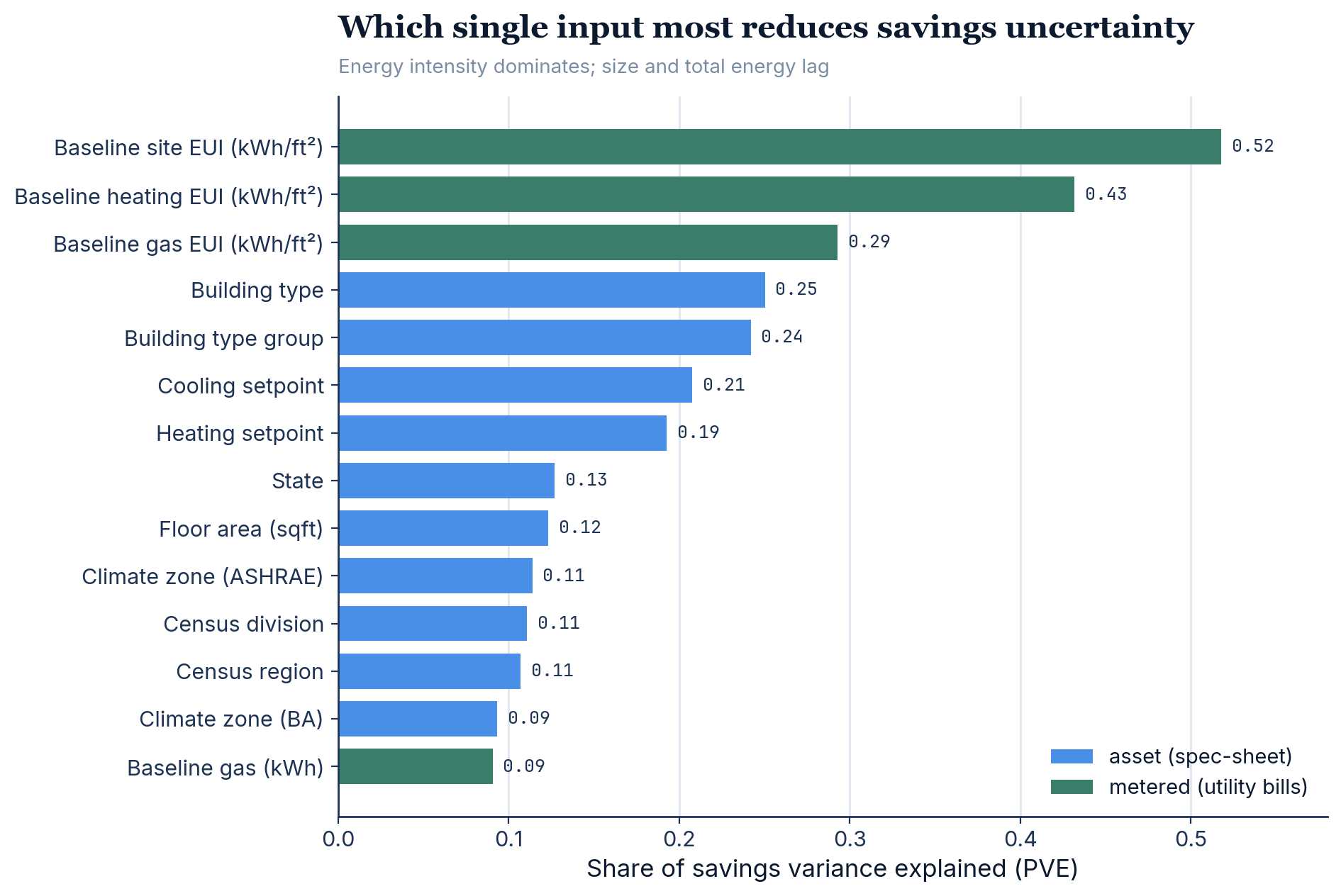
Looking at the results, the dominant drivers for the HP-RTU are the building’s actual energy intensity (energy use per ft², from utility bills), then building type, operating/setpoint behavior, and climate. Notably, floor area and total energy in absolute terms are weak predictors of per-ft² savings — it is energy intensity, not size, that carries the signal.
The right information collapses the uncertainty — but only the right information
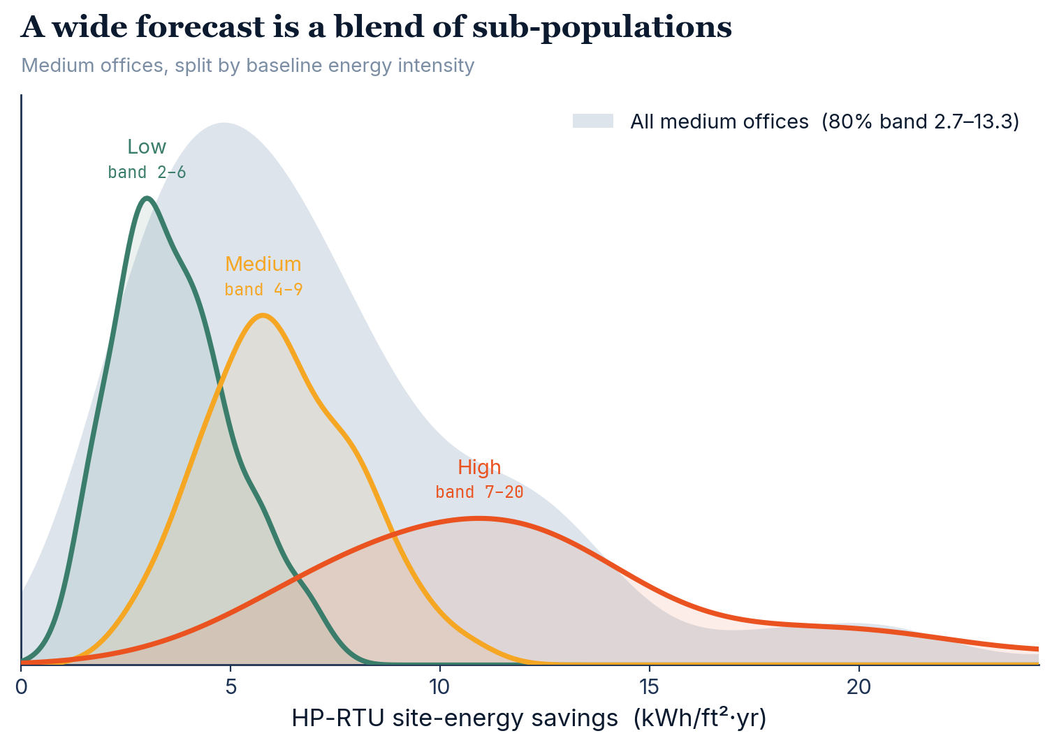
To further illustrate this, the same wide distribution can be understood as a mixture of distinct sub-populations. Splitting one building type (medium office) by its baseline energy intensity resolves the broad curve into tighter, separated components:
Ranking inputs one at a time tells you what matters in isolation, but in practice you collect several things together — and closely related inputs overlap. So we ask a sharper question: starting from nothing, what is the best input to add next, and when do the returns flatten?
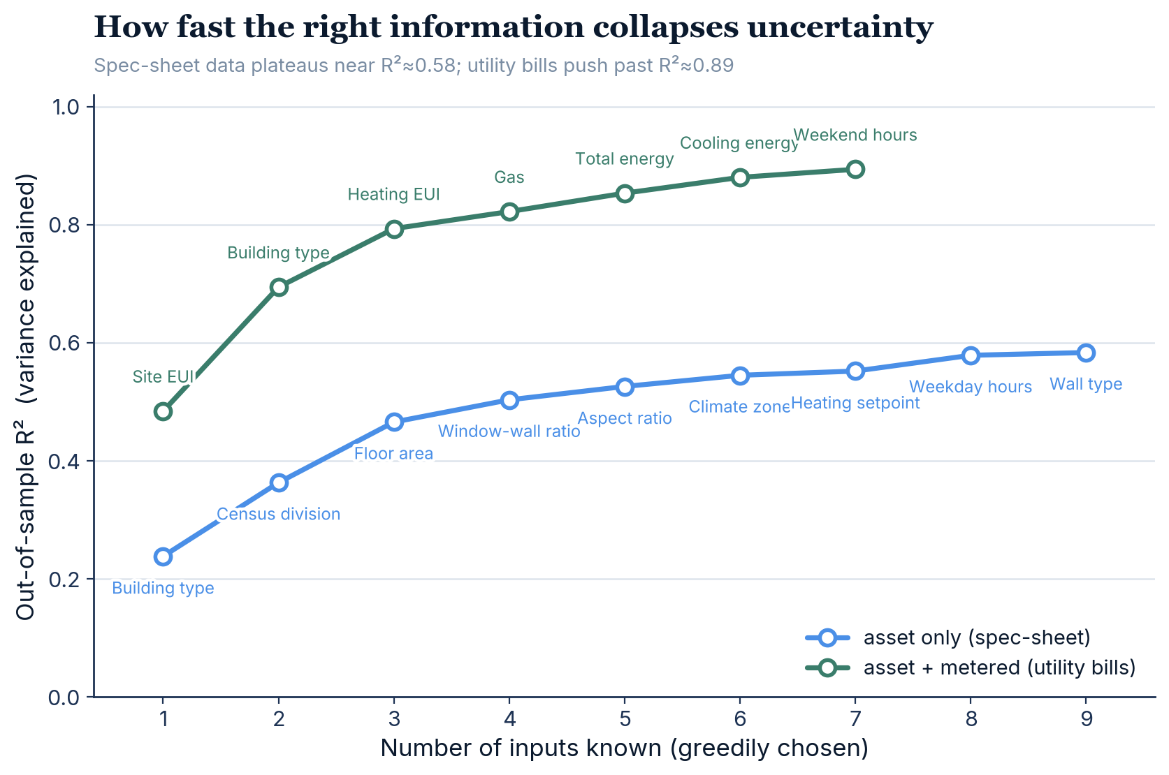
We answer it with greedy forward selection. Begin with no information. Using the same Comstock simulation dataset, we train a simple prediction model to predict savings, try adding each candidate input in turn, and keep the one that most improves accuracy. Repeat, adding one input at a time, until extra inputs barely move the needle. The model is a gradient-boosted tree (which captures nonlinear effects and interactions between inputs), and accuracy is measured as out-of-sample R² — the fraction of savings variation the model explains on buildings it was not trained on (our validation hold-out). Measuring on held-out buildings keeps the score honest and, as a bonus, means a new input that merely duplicates one you already have earns almost nothing — so the procedure naturally skips redundant signals.
We run the selection twice: once using only spec-sheet inputs (building type, size, vintage, climate, system type), and once also allowing utility-bill inputs (the building’s actual energy intensities).
The result is the curve’s shape. Spec-sheet data alone plateaus around R² ≈ 0.58 — no amount of asset detail gets past it. Add the bill-derived energy intensities and accuracy climbs to R² ≈ 0.89, with just the first three inputs (energy intensity, building type, heating intensity) already reaching ≈ 0.79.
One caveat: greedy selection is a fast approximation, not a guaranteed-optimal search. But the two robust takeaways — diminishing returns, and the clear gap between a spec sheet and a utility bill — are exactly what tell you which data is worth the effort to collect.
Two findings matter for data collection:
- Asset/spec-sheet information alone plateaus at roughly R² ≈ 0.58 — building type, vintage, geometry, climate, and so on can only take you so far.
- Adding metered energy intensity (from utility bills) reaches R² ≈ 0.89, and just three signals — baseline site intensity, building type, and baseline heating intensity — already reach R² ≈ 0.79.
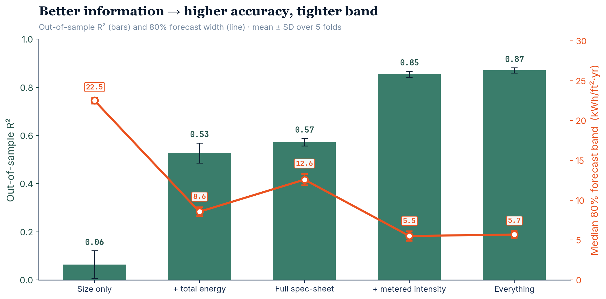
The same story in terms of the forecast band width (calibrated 80% intervals), across progressively richer information tiers:
| Information available | Out-of-sample R² | 80% forecast band |
|---|---|---|
| Floor area only | 0.01 | 21.9 |
| Floor area + total energy | 0.54 | 9.5 |
| Full spec-sheet (no bills) | 0.58 | 13.1 |
| Spec-sheet + metered intensity | 0.87 | 5.7 |
Uncertainty is not uniform — and that is useful
Information does not shrink the band equally for every building. For two-thirds of medium offices (low- and medium-intensity), the 80% band collapses from ~10.6 to ~4 kWh/ft²·yr; but the high-intensity third remains genuinely wide (~13). The largest savings and the largest residual uncertainty live together in the high-energy tail.
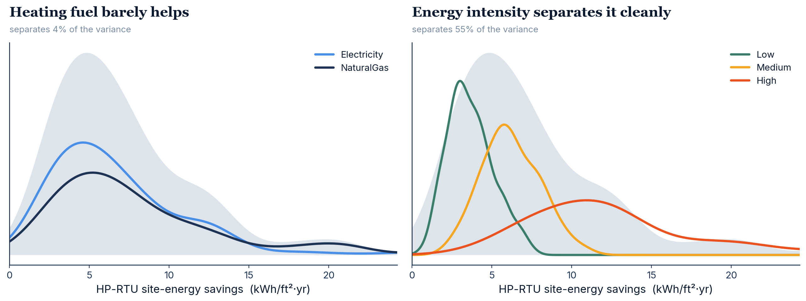
This is why we model the whole distribution: it tells us not only the expected savings but which buildings are confidently predictable and which warrant additional measurement — turning uncertainty into a guide for where data collection pays off.
Implications
The building stock exhibits large, structured, irreducible-from-limited-data variability in ECM savings. A credible methodology must therefore (a) be calibrated to the physics model, (b) express uncertainty explicitly as a range, and (c) run on the limited information an owner can realistically provide.
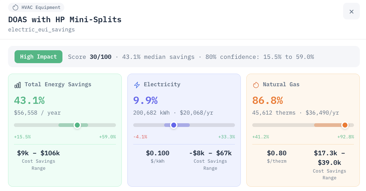
We’ve built this directly into Energy Pilot. The savings figure a user sees isn’t a point estimate dressed up with error bars — it’s the q10–q90 band straight out of the quantile models, widening or tightening with exactly the inputs this post describes. When the bills are missing, the band is honest about it; when they’re there, it collapses accordingly. That’s the whole point of modeling the distribution rather than a single number: it’s what makes a forecast something a practitioner can actually act on.